

WHAT YOU NEED TO KNOW
Using css grid auto placement allows web browsers to automatically position elements within a grid container without requiring explicit grid-column or grid-row rules for every child item.
- The default placement engine arranges items by row, filling columns from left to right before spilling over into a new row track.
- You can instantly switch the layout direction using the grid-auto-flow property to arrange elements column by column instead.
- Enabling the dense value packs smaller elements into empty slots left behind by larger elements, optimizing screen real estate automatically.
- Track sizing in the implicit grid is handled via grid-auto-rows and grid-auto-columns to prevent content overflow.
The exact rendering order of your content relies heavily on your DOM document structure and any CSS order properties applied to individual items.
What is CSS Grid Auto Placement?
What is css grid auto placement? It is the browser engine’s built-in algorithm that positions grid items when you do not explicitly assign them grid coordinates. Instead of writing separate grid-column and grid-row coordinates for every card, image, or text block, you define the grid container rules and let Cascading Style Sheets (CSS) do the heavy lifting. This automatic placement system acts as a smart engine that fills grid cells sequentially, keeping your CSS clean and maintainable.
According to documentation on MDN Web Docs, when you do not provide explicit placement instructions, one grid item is automatically allocated to each available grid cell by default. This makes css grid automatic placement the most efficient mechanism for dynamic feeds, user dashboards, and photo galleries where content volumes change frequently.
Explicit vs. Implicit Grids
When building layouts, you declare an explicit grid by using properties like grid-template-columns and grid-template-rows. However, if your content exceeds the defined grid capacity, the browser automatically spawns new rows or columns to house the remaining items. This automatically generated structure is called the implicit grid.
Understanding the boundary between these two states is key when utilizing a grid-auto-flow guide to direct your content flow. Explicit tracks maintain rigid sizes defined by you, while implicit tracks fall back to auto-sizing behaviors unless you specify a default size via auto-placement properties.
Default Rules for Auto-Placement
When the layout engine processes unplaced grid items, it relies on a strict set of fallback behaviors to position elements in sequence. These internal rules dictate the visual outcome of your layouts without requiring explicit styling commands.
- Source-code order: The layout engine places elements in the order they appear inside your Document Object Model (DOM) tree.
- Row-first direction: Items are placed row by row, packing the first row completely before creating or moving to the next row track.
- Single cell allocation: By default, each unplaced item spans exactly one column track and exactly one row track.
- Implicit track generation: If you have 12 grid items but your explicit grid template only accommodates nine, the browser automatically generates new implicit tracks to hold the final three items.

Controlling Flow with the `grid-auto-flow` Property
The grid-auto-flow property is the primary switch that tells the layout engine how to sequence auto-placed elements. By altering this value, you can decide whether the browser builds a grid row-by-row or column-by-column.
| Property Value | Layout Direction | Sparseness Behavior | Ideal Use Case |
|---|---|---|---|
| row | Horizontal | Sparse (backtracking disabled) | Standard article cards, text-heavy grids |
| column | Vertical | Sparse (backtracking disabled) | Side-scrolling app cards, visual timelines |
| row dense | Horizontal | Dense (backtracking enabled) | Asymmetric image galleries, mixed-size dashboards |
| column dense | Vertical | Dense (backtracking enabled) | Pinterest-style masonry columns, variable media feeds |
Auto-Placement by Row (Default)
By default, the grid container assigns items to row tracks first. The browser starts at the top-left cell, fills each column in the current row, and then moves down to the next row track. If you do not write any grid-auto-flow property, the browser assumes the row value automatically.
Auto-Placement by Column
By declaring grid-auto-flow: column, you shift the flow direction by 90 degrees. The browser fills the columns from top to bottom first, moving to the next column track only after filling all rows in the current track. This behavior forces the creation of implicit column tracks to the right if you have more items than your explicit column template allows.
The `dense` Keyword: Packing the Grid and Filling Gaps
When mixed-size items span multiple tracks, a standard sparse grid layout will often leave empty white spaces behind. The dense keyword instructs the browser to backtrack and fill those empty pockets with smaller items that appear later in the DOM. This maximizes grid space, though it may alter the visual reading order of your document.
How the Auto-Placement Algorithm Works
The layout engine follows a highly structured, multi-step layout algorithm to map items to grid coordinates. Knowing how this algorithm works makes debugging complex grids straightforward.
Order of Placed vs. Unplaced Grid Items
Before the browser deals with any auto-placed elements, it processes and positions every item that has explicit grid lines specified. For example, if item two and item five have explicit grid positions, the browser places them first. The remaining unplaced items then flow into the remaining vacant spaces following the standard layout direction.
Handling Items that Span Multiple Tracks
You can combine auto-placement with spanned tracks by declaring rules like grid-column-end: span 2. The layout algorithm auto-places the item’s starting line first, and then spans the item across the requested number of tracks. If an item cannot fit into the remaining columns of a row, the algorithm pushes the entire item to the next row, leaving an empty layout gap behind.
Anonymous Grid Items and Auto-Placement
If you have direct text nodes directly inside your grid container without wrapping HTML elements, the browser treats them as anonymous grid items. The auto-placement engine still processes these text strings, dedicating an individual cell to each text block just like a standard element.
Sizing Tracks in the Implicit Grid
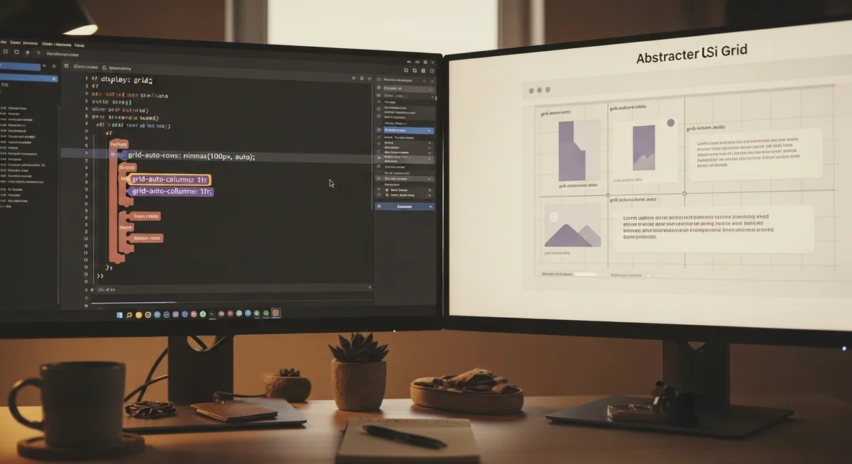
When items spill over into the implicit grid, you must control how those new tracks size themselves. Without explicit rules, implicit rows and columns fallback to auto-sizing, stretching based on their contents.
- grid-auto-rows: Defines the default height of any implicitly generated row tracks in your grid container.
- grid-auto-columns: Defines the default width of any implicitly generated column tracks.
- Multiple values: You can pass a track listing pattern like grid-auto-rows: 100px 200px to cycle row heights repeatedly.
Sizing Implicit Rows Using `minmax()`
You can prevent elements from overflowing by using the minmax function within your implicit row declarations. Setting grid-auto-rows: minmax(100px, auto) ensures that every implicit row is at least 100px tall. If an item inside that row has content that runs longer, the track will grow dynamically to fit the content safely.
Sizing Implicit Rows with a Track Listing
When you pass multiple track sizes to grid-auto-rows, the browser repeats that track pattern infinitely. For example, declaring grid-auto-rows: 150px 300px forces the first implicit row to be 150px high and the second implicit row to be 300px high. This alternating sequence repeats for every subsequent implicit row needed.
Dynamic Auto-Placement: `auto-fill` vs. `auto-fit`
When creating highly responsive grids without media queries, you will often use repeat alongside auto-fill or auto-fit. While both keywords automatically generate tracks to fill the available space, they handle excess column tracks differently when content is sparse.
According to developer guidelines on web.dev, choosing between these values depends entirely on whether you want your elements to stretch or leave empty tracks on the side.
| Keyword | Track Generation Behavior | Handling of Empty Tracks | Visual Result |
|---|---|---|---|
| auto-fill | Creates as many tracks as will fit | Retains empty tracks as open space | Items maintain size, empty space remains on right |
| auto-fit | Creates as many tracks as will fit | Collapses any empty tracks to 0px | Remaining items stretch to fill the entire container width |
Use Cases and Limitations of Auto-Placement
Auto-placement is exceptionally powerful, but it does have specific architectural boundaries that web developers must navigate.
- Visual reading mismatch: Using the dense keyword can jumble layout structures, creating accessibility issues for screen readers.
- Dynamic dashboards: Perfect for admin dashboards where widgets of varying sizes need to pack together cleanly.
- Asymmetric media grids: Speeds up portfolio building by flowing portrait and landscape images into gaps without custom inline styles.
- Layout limitations: You cannot use auto-placement to overlap elements, as the algorithm strictly forces items into non-overlapping grid coordinates unless positioned manually.